Exploring Land Cover Data (Impact Observatory)#
General Exploration Standard Python
![]()
![]()
![]()
![]()
![]()
Context#
Purpose#
Introduce manipulation and exploratory analysis of classified land use and cover data, using example data created by Impact Observatory from ESA Sentinel-2 imagery.
Dataset description#
There are now many classified (categorical) land cover data products freely available that are useful for Environmental Data Science. These include:
ESA CCI land cover, 300m spatial resolution global extent for years 1992-2015
Copernicus Global Land Cover, 100m spatial resolution global extent for years 2015-2019
USGS LCMAP, 30m spatial resolution for USA for years 1985-2020
UKCEH LCMs, various spatial resolutions for UK for various years 1990-2020
mapbiomas, 30m spatial resolution for Brazil for years 1985-2020
Impact Observatory, 10m spatial resolution global extent for 2017-2021
These products are provided as 2D rasters (spatial) or 3D data cubes (spatio-temporal). The number and classification of discrete land cover classes varies between products, but at their most basic will distinguish between broad land covers such as ‘crops’, ‘forest’ and ‘built-up’. The nominal (categorical) character of the data influences the types of analysis appropriate.
This notebook uses data created by Impact Observatory. The data are a time series for 2017-2021 of annual global land use and land cover (LULC) mapped at 10m spatial resolution. The data are derived from ESA Sentinel-2 imagery with each annual map specifying individual pixels as belonging to one of 9 LULC classes. The Impact Observatory LULC model uses deep learning methods to infer a single annual LULC class for each pixel in a Sentinel-2 image. Each annual global LULC map is produced by aggregating multiple inferences for images from across a given year (requiring processing approximately 2 million images to create each annual map).
Highlights#
Fetch land cover product data from an online repository
Visualise the data (maps and spatio-temporal plots)
Analyse aggregate change through bar charts and similar visualisation
Analyse pixel-by-pixel change including use of sankey diagrams
Analyse zonal change using ancillary vector data
Contributions#
Notebook#
James Millington (author), Dept of Geography, King’s College London, @jamesdamillington
Anne Fouilloux (reviewer), Dept of Geosciences, University of Oslo, @annefou
Amandine Debus (reviewer), Dept of Geography, University of Cambridge, @aedebus
Dataset originator/creator#
Esri (licensor)
Impact Observatory (processor, producer, licensor)
Microsoft (host)
The data are available under a Creative Commons BY-4.0 license.
Dataset reference and documentation#
Krishna Karra, Caitlin Kontgis, Zoe Statman-Weil, Joseph C. Mazzariello, Mark Mathis, and Steven P. Brumby. Global land use / land cover with sentinel 2 and deep learning. In 2021 IEEE International Geoscience and Remote Sensing Symposium IGARSS, volume, 4704–4707. 2021. doi:10.1109/IGARSS47720.2021.9553499.
Impact Observatory. Methodology & accuracy summary. URL: https://www.impactobservatory.com/static/lulc_methodology_accuracy-ee742a0a389a85a0d4e7295941504ac2.pdf (visited on 2022-07-01).
Code#
Data loading code built on snippet from @acocac via ODC.stac docs and a Microsoft Planetary example notebook.
Load libraries#
Show code cell source
#system
import os
import warnings
warnings.filterwarnings(action='ignore')
#data handling
import pystac_client
import odc.stac
from pystac.extensions.item_assets import ItemAssetsExtension
import geopandas as gpd
import rasterio as rio
import numpy as np
import pandas as pd
from shapely.geometry import Polygon
import xarray as xr
import rioxarray
#visualisation
import matplotlib.pyplot as plt
import matplotlib.colors as mplc
import holoviews as hv
import hvplot.pandas
from holoviews import opts, dim
#data analysis
from sklearn import metrics #for confusion matrix
from rasterstats import zonal_stats
Set project structure#
The next cell creates a separate folder to save any notebook outputs you should wish (e.g. below we use this directory in the demo of how you might load data from a local file).
notebook_folder = './notebook'
if not os.path.exists(notebook_folder):
os.makedirs(notebook_folder)
1. Fetch and Load Data#
This notebook uses annual land cover data from Impact Observatory, 10m spatial resolution and global extent for 2017-2021. These data are hosted online by Microsoft’s Planetary Computer which enable you, the user, to run the code in the cloud (e.g. via binder).
Below we will use the pystac-client package to access STAC information from the Planetary Computer API, then read it using the odc-stac package. In doing so we will:
fetch data for a study area in Mato Grosso, Brazil
resample the original 10m spatial resolution to 300m (to decrease execution times in this example notebook)
Note
Fetching the data from the cloud adds some steps that would not be necessary had you already downloaded the data to your local machine. Consequently, in future for your own work you might ignore the Cloud Data code blocks and start from Local Data.
Cloud Data#
First we need to specify the location and extent of study area to fetch the relevant data. We do this by specying a bounding box around the center point of the study area.
#specify center point of the study area
x, y = (-56.1, -12.2) #area in MT
#define a square bounding box for the study area
km2deg = 1.0 / 111 #1 deg corresponds to approximately 111 km at the equator
xd = 200 * km2deg
yd = 325 * km2deg
study_bbox_coords = [[x - xd, y - yd], [x - xd, y + yd], [x + xd, y + yd], [x + xd, y - yd]]
#view bounding box
study_bbox_coords
[[-57.9018018018018, -15.127927927927928],
[-57.9018018018018, -9.27207207207207],
[-54.2981981981982, -9.27207207207207],
[-54.2981981981982, -15.127927927927928]]
We can then visualise the location and extent of the study area using hvPlot.
#create a GeoPandas GeoDataFrame
study_poly = Polygon(study_bbox_coords)
crs = {'init': 'epsg:4326'}
sa_gpd = gpd.GeoDataFrame(index=[0], crs=crs, geometry=[study_poly])
#interactive plot using hvplot.pandas
sa_gpd_interactive = sa_gpd.hvplot(
geo=True,crs=sa_gpd.crs.to_epsg(),alpha=0.5, xlim=(-75, -35), ylim=(-30, 10), tiles='CartoLight')
sa_gpd_interactive
With our study area defined, we can now query Microsoft Planetary Computer data that is available for this location using pystac-client.
catalog = pystac_client.Client.open("https://planetarycomputer.microsoft.com/api/stac/v1")
#https://pystac-client.readthedocs.io/en/latest/tutorials/pystac-client-introduction.html#API-Search
query = catalog.search(
collections=["io-lulc-9-class"],
limit=100,
bbox=study_poly.bounds
)
#https://pystac-client.readthedocs.io/en/latest/tutorials/pystac-client-introduction.html#Items
items = list(query.get_items())
print(f"Found: {len(items):d} datasets")
print(items)
Found: 6 datasets
[<Item id=21L-2022>, <Item id=21L-2021>, <Item id=21L-2020>, <Item id=21L-2019>, <Item id=21L-2018>, <Item id=21L-2017>]
For the available datasets we can access and view the associated metadata.
stac_json = query.get_all_items_as_dict() # Convert STAC items into a GeoJSON FeatureCollection
gdf = gpd.GeoDataFrame.from_features(stac_json) #convert GeoJSON to GeoPandas to view nicely
gdf.head()
| geometry | datetime | proj:bbox | proj:epsg | io:tile_id | proj:shape | end_datetime | proj:transform | start_datetime | io:supercell_id | |
|---|---|---|---|---|---|---|---|---|---|---|
| 0 | POLYGON ((-54.00000 -8.00195, -54.00000 -16.00... | None | [169256.89710350562, 8228747.785209756, 830736... | 32721 | 21L | [88695, 66148] | 2023-01-01T00:00:00Z | [10.0, 0.0, 169256.89710350562, 0.0, -10.0, 91... | 2022-01-01T00:00:00Z | 21L |
| 1 | POLYGON ((-54.00000 -8.00195, -54.00000 -16.00... | None | [169256.89710350562, 8228747.785209756, 830736... | 32721 | 21L | [88695, 66148] | 2022-01-01T00:00:00Z | [10.0, 0.0, 169256.89710350562, 0.0, -10.0, 91... | 2021-01-01T00:00:00Z | 21L |
| 2 | POLYGON ((-54.00000 -8.00195, -54.00000 -16.00... | None | [169256.89710350562, 8228747.785209756, 830736... | 32721 | 21L | [88695, 66148] | 2021-01-01T00:00:00Z | [10.0, 0.0, 169256.89710350562, 0.0, -10.0, 91... | 2020-01-01T00:00:00Z | 21L |
| 3 | POLYGON ((-54.00000 -8.00195, -54.00000 -16.00... | None | [169256.89710350562, 8228747.785209756, 830736... | 32721 | 21L | [88695, 66148] | 2020-01-01T00:00:00Z | [10.0, 0.0, 169256.89710350562, 0.0, -10.0, 91... | 2019-01-01T00:00:00Z | 21L |
| 4 | POLYGON ((-54.00000 -8.00195, -54.00000 -16.00... | None | [169256.89710350562, 8228747.785209756, 830736... | 32721 | 21L | [88695, 66148] | 2019-01-01T00:00:00Z | [10.0, 0.0, 169256.89710350562, 0.0, -10.0, 91... | 2018-01-01T00:00:00Z | 21L |
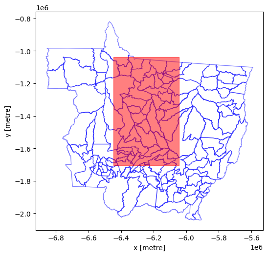
The global LULC datasets are for ‘tiles’ covering regions of the earth’s surface - each line in the DataFrame above is for one year for tile 21L. We can also plot to show the study area does not cover multiple land cover tiles.
Show code cell source
%matplotlib inline
fig, axes = plt.subplots(figsize=(6, 12))
#tiles are
gdf.plot(
"io:tile_id",
ax=axes,
edgecolor="blue",
categorical=True,
aspect="equal",
alpha=0.5,
legend=True,
legend_kwds={"loc": "upper left", "frameon": False, "ncol": 1},
)
#add polygon to show our study area
sa_gpd.plot(edgecolor="red", facecolor="none", ax=axes)
plt.show()
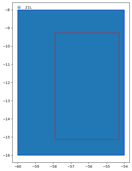
From the figure above we can see the whole study area (represented by the red rectangle) is within in the tiles (represented by the blue rectangles) returned by the pystac query.
Now we are happy we know what datasets we wish to fetch, we can use odc-stac to fetch and load the data into memory, specifying the projection and spatial resolution we want as well as how we want data grouped in layers:
Show code cell source
#projection
SMepsg = 3857 #https://epsg.io/3857 Geographic crs, units are m
SMepsg_str = "epsg:{0}".format(SMepsg)
#spatial resolution (in units of projection)
datares = 300
#https://odc-stac.readthedocs.io/en/latest/_api/odc.stac.load.html
lcxr = odc.stac.load(
items, #load the items from our query above
groupby="start_datetime", #create spatial layers that have the same timestamp
chunks={}, #use Dask to speed loading
dtype='int',
#next lines load study area at resolution specified by datares variable
#without these entire image is returned at original resolution
crs=SMepsg_str, #specify the desired crs
resolution=datares, #specify the desired spatial resolution (units as per crs)
bbox=study_poly.bounds, #specify bounding box in Lon/Lat (ignores crs units, use x,y to use crs units)
resampling="mode" #ensure sensible type for categorical data (options seem to be as for datacube.Datacube.load)
)
The data object we have created is an xarray Dataset which is a dict-like collection of DataArray objects with aligned dimensions. We can check the dimensions, coordinates, data and attributes (see xarray terminology):
lcxr
<xarray.Dataset> Size: 143MB
Dimensions: (y: 2225, x: 1338, time: 6)
Coordinates:
* y (y) float64 18kB -1.037e+06 -1.037e+06 ... -1.704e+06
* x (x) float64 11kB -6.446e+06 -6.445e+06 ... -6.045e+06
spatial_ref int32 4B 3857
* time (time) datetime64[ns] 48B 2017-01-01 2018-01-01 ... 2022-01-01
Data variables:
data (time, y, x) int64 143MB dask.array<chunksize=(1, 2225, 1338), meta=np.ndarray>Load Local Data#
In the previous section we fetched data from an online repository and loaded it into memory. In the sections below we will continue to work with that (and you can skip to the next section now, if you don’t want to see how to save and/or read data from a local drive).
The recommended way to store xarray data structures is netCDF, a binary file format for self-described datasets that originated in the geosciences.
For example, to save the xarray Dataset we created above on disk as netCDF, we would use something like:
lcxr.to_netcdf(os.path.join(notebook_folder,"MT-study-area.nc"))
Then to load the local netCDF file into a xarray Dataset we would use:
lcxr_disk = xr.open_dataset(os.path.join(notebook_folder,"MT-study-area.nc"), decode_coords="all")
Tip
If you have saved this notebook to a local machine, try uncommenting the code below and running it. Check you can see where the data has been saved on your local machine and note how the Dataset loaded is identical to the one you saved.
#lcxr.to_netcdf(os.path.join(notebook_folder,"MT-study-area.nc"))
#lcxr_disk = xr.open_dataset(os.path.join(notebook_folder,"MT-study-area.nc"), decode_coords="all")
#lcxr_disk
2. Visualisation#
Our dataset contains a 2D raster layer of land cover types for individual snapshots in time. Each map is a composite of land use/cover predictions for 9 classes throughout the year in order to generate a representative snapshot of each year.
We can visualise these spatio-temporal data in a variety of different ways, both static and interactive. But before exploring these, we will create a matplotlib colormap to display the 9 land cover classes with intuitive colors.
Show code cell source
%matplotlib inline
#class names and IDs are held in an 'asset' of the collection
collection = catalog.get_collection("io-lulc-9-class")
ia = ItemAssetsExtension.ext(collection)
iaa = ia.item_assets["data"]
#get the names of the land cover classes with their ID in the raster (as a dictionary, name:ID)
class_names = {iaa["summary"]: iaa["values"][0] for iaa in iaa.properties["file:values"]}
#flip the keys:values in the dictionary (to create ID:name)
values_to_classes = {v: k for k, v in class_names.items()}
max_class = max(values_to_classes.keys())
#construct a matplotlib colormap
with rio.open(items[0].assets["data"].href) as src:
colormap_def = src.colormap(1) # get metadata colormap for band 1
colormap = [
np.array(colormap_def[i]) / 255 for i in range(max_class+1)
] # transform to matplotlib color format
lc_cmap = mplc.ListedColormap(colormap)
print(class_names)
lc_cmap
{'No Data': 0, 'Water': 1, 'Trees': 2, 'Flooded vegetation': 4, 'Crops': 5, 'Built area': 7, 'Bare ground': 8, 'Snow/ice': 9, 'Clouds': 10, 'Rangeland': 11}

Note
Note that there are more than 9 colours in the colormap created - that’s because we also have colours for ‘No Data’ and for class IDs that are not used (skipped) in the data (e.g. there’s no land cover class 6 - we’ll label these as No Data below).
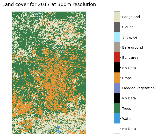
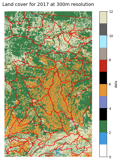
Now we can use the colormap with matplotlib to plot a static 2D map for a given time point.
Show code cell source
%matplotlib inline
ts='2017' #which year layer
#plotting helpers
vmin = 0
vmax = lc_cmap.N
p=lcxr.sel(time=ts).isel(time=0).to_array("band").plot.imshow(
col="band",
cmap=lc_cmap,
vmin=vmin, vmax=vmax,
size=6
)
ticks = np.linspace(start=vmin+0.5, stop=vmax-0.5, num=vmax)
labels = [values_to_classes.get(i, "No Data") for i in range(vmax)]
p.cbar.set_ticks(ticks, labels=labels)
plt.axis('scaled')
plt.axis('off')
plt.title("Land cover for {0} at {1}m resolution".format(ts, datares), size=14)
plt.show()
Similarly, we could make a static plot showing maps for each point in time to visually examine change.
Show code cell source
%matplotlib inline
p = lcxr.data.plot(
col="time",
cmap=lc_cmap,
vmin=vmin, vmax=vmax,
figsize=(16, 5)
)
ticks = np.linspace(start=vmin+0.5, stop=vmax-0.5, num=vmax)
labels = [values_to_classes.get(i, "No Data") for i in range(vmax)]
p.cbar.set_ticks(ticks, labels=labels)
for axes in p.axes.flat:
axes.axis('off')
axes.axis('scaled')
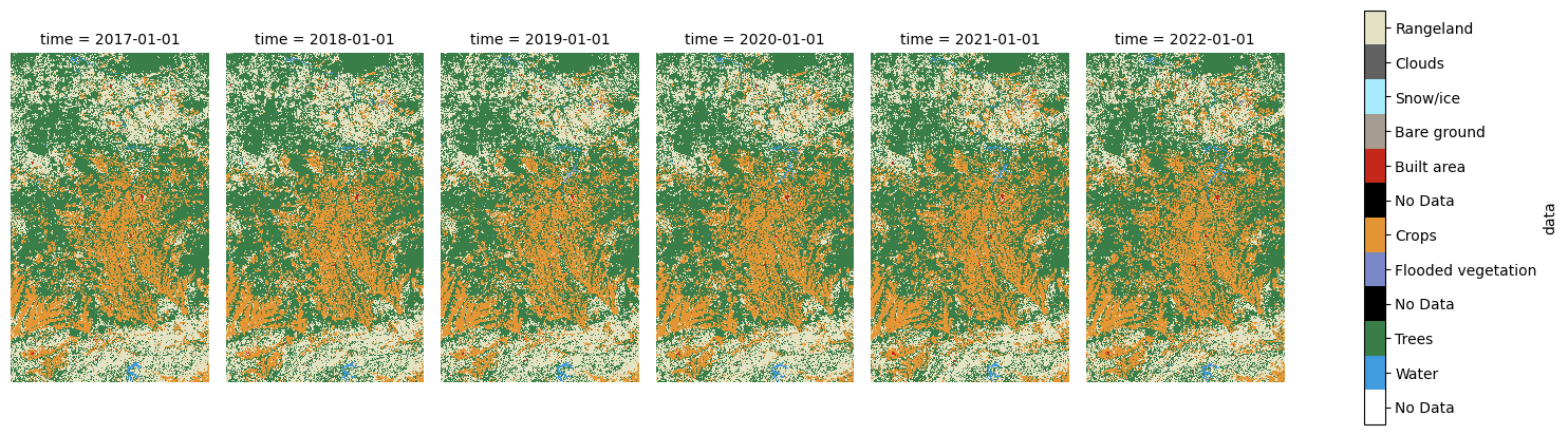
We can use holoviews to create an interactive plot - you should be able to use the slider below to see change through time in the same space.
Show code cell source
#plotting helpers
levels = [i for i in range(lc_cmap.N)]
bnorm = mplc.BoundaryNorm(levels, ncolors=len(levels))
#https://holoviews.org/user_guide/Gridded_Datasets.html?highlight=dask#working-with-xarray-data-types
hv.extension('matplotlib')
hv_ds = hv.Dataset(lcxr)[:, :, :]
lcmaps = hv_ds.to(hv.Image, kdims=["x", "y"], dynamic=True).options(cmap=lc_cmap, norm=bnorm, fig_inches=(5,8), colorbar=True)
lcmaps


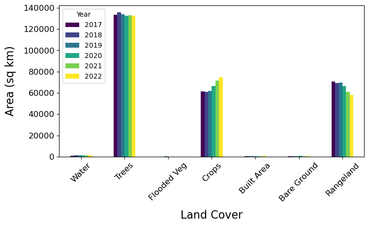
3. Analysing Aggregate Change#
In this section we’re going to examine land cover change across the study area. Our aim is to produce a bar plot that shows increases or decreases in land area for each land cover class between two points in time.
We can quickly identify the unique values in our land cover maps and how many times they are observed (i.e. how many pixels fall in each land cover class). We can use numpy’s .unique function to count the occurrence of each value, then output as a Pandas DataFrame.
#list to hold pixel counts, class ID:name dict as list to append to
counts_ls = [values_to_classes]
#loop over items
for i, j in enumerate(items):
lcmap = lcxr.isel(time=i).to_array("band") #get pixels for this year as an array
unique, counts = np.unique(lcmap, return_counts=True) #get the unique values and corresponding counts
lcmap_counts = dict(zip(unique, counts)) #combine them into a dict for easier viewing
counts_ls.append(lcmap_counts)
counts_df = pd.DataFrame(counts_ls).T #create df from list and transpose
#create list of data years as string
counts_yr = list(lcxr["time"].values.astype('datetime64[Y]').astype('str'))
counts_yr.insert(0, "Land Cover") #insert 'LC'
counts_df.columns = counts_yr #then use as df header
counts_df #print
| Land Cover | 2017 | 2018 | 2019 | 2020 | 2021 | 2022 | |
|---|---|---|---|---|---|---|---|
| 0 | No Data | NaN | NaN | NaN | NaN | NaN | NaN |
| 1 | Water | 11414 | 12011 | 13848 | 13921 | 14273 | 14892 |
| 2 | Trees | 1485124 | 1506206 | 1489276 | 1474662 | 1477771 | 1472174 |
| 4 | Flooded vegetation | 1157 | 1532 | 2369 | 1435 | 1358 | 1437 |
| 5 | Crops | 683380 | 678552 | 685153 | 737470 | 793002 | 833377 |
| 7 | Built area | 5583 | 5882 | 5929 | 6243 | 6546 | 6973 |
| 8 | Bare ground | 4859 | 2589 | 6022 | 6758 | 5217 | 4654 |
| 9 | Snow/ice | NaN | NaN | NaN | NaN | NaN | NaN |
| 10 | Clouds | NaN | NaN | NaN | NaN | NaN | NaN |
| 11 | Rangeland | 785533 | 770278 | 774453 | 736561 | 678883 | 643543 |
It might be more intuitve (and useful) to work in units of area (e.g. square km) rather than pixel counts, so let’s convert the pixel counts to area (sq km):
def cell_to_sqkm(x):
return x * ((datares*datares) / 1000000)
sqkm_df = counts_df.copy(deep=False)
sqkm_df.loc[:,'2017':] = sqkm_df.loc[:,'2017':].apply(cell_to_sqkm)
sqkm_df
| Land Cover | 2017 | 2018 | 2019 | 2020 | 2021 | 2022 | |
|---|---|---|---|---|---|---|---|
| 0 | No Data | NaN | NaN | NaN | NaN | NaN | NaN |
| 1 | Water | 1027.26 | 1080.99 | 1246.32 | 1252.89 | 1284.57 | 1340.28 |
| 2 | Trees | 133661.16 | 135558.54 | 134034.84 | 132719.58 | 132999.39 | 132495.66 |
| 4 | Flooded vegetation | 104.13 | 137.88 | 213.21 | 129.15 | 122.22 | 129.33 |
| 5 | Crops | 61504.2 | 61069.68 | 61663.77 | 66372.3 | 71370.18 | 75003.93 |
| 7 | Built area | 502.47 | 529.38 | 533.61 | 561.87 | 589.14 | 627.57 |
| 8 | Bare ground | 437.31 | 233.01 | 541.98 | 608.22 | 469.53 | 418.86 |
| 9 | Snow/ice | NaN | NaN | NaN | NaN | NaN | NaN |
| 10 | Clouds | NaN | NaN | NaN | NaN | NaN | NaN |
| 11 | Rangeland | 70697.97 | 69325.02 | 69700.77 | 66290.49 | 61099.47 | 57918.87 |
We can see that some land cover classes are not present in any year (indicated by NaN). We’ll drop these and also reshape the data from ‘wide’ to ‘long’ for plotting.
sqkm_df = sqkm_df.dropna() #drop No Data rows
#make data long
sqkm_df_long = pd.melt(sqkm_df, id_vars=['Land Cover'])
sqkm_df_long.rename(columns={'variable':'Year','value':'Area (sq km)'}, inplace = True)
From the Pandas DataFrame we can create both static and interactive bar plots. Here’s the static version with matplotlib.
Show code cell source
%matplotlib inline
fig, ax1 = plt.subplots(1, figsize=(8,4))
#drop NAN rows from data when plotting
sqkm_df[sqkm_df['2017'] > 0].set_index('Land Cover').plot(kind='bar', ax=ax1, cmap='viridis')
x_ticks_labels = ['Water','Trees','Flooded Veg','Crops', 'Built Area', 'Bare Ground', 'Rangeland']
ax1.set_xticklabels(x_ticks_labels, rotation=45)
plt.tick_params(labelsize=12)
plt.xlabel('Land Cover', labelpad=10, fontsize=16)
plt.ylabel("Area (sq km)",labelpad=10, fontsize=16)
plt.legend(title="Year")
plt.show()
Tip
We could also do an interactive plot with hvplot for Pandas data (see the cell below).
Show code cell source
hv.extension('bokeh')
color_lst = [mplc.to_hex(colormap[1]),mplc.to_hex(colormap[2]),mplc.to_hex(colormap[4]),
mplc.to_hex(colormap[5]),mplc.to_hex(colormap[7]),mplc.to_hex(colormap[8]),mplc.to_hex(colormap[11])]
lc_year_bar = sqkm_df_long.hvplot.bar(y='Area (sq km)', x='Land Cover', by='Year', rot=90).options(
color='Land Cover', cmap=color_lst, show_legend=False)
lc_year_bar

Note
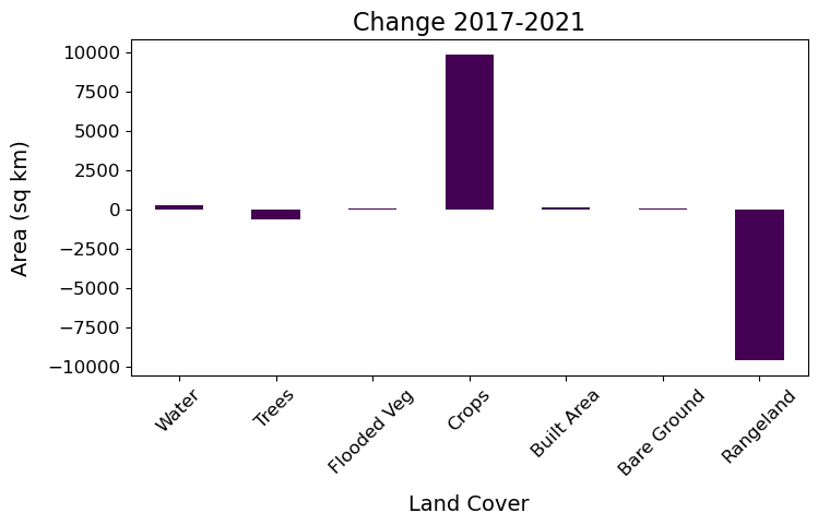
From the plots above we can see that through time the Trees and Rangeland classes have decreased in area, while Crops has increased.
We could also show this by calculating and plotting the change between first and final time snapshot.
Show code cell source
%matplotlib inline
#calculate
sqkm_df['Diffc-1721'] = sqkm_df['2021'] - sqkm_df['2017']
#plot
fig, ax1 = plt.subplots(1, figsize=(8,4))
sqkm_df['Diffc-1721'].plot(kind='bar', ax=ax1, cmap='viridis')
x_ticks_labels = ['Water','Trees','Flooded Veg','Crops', 'Built Area', 'Bare Ground', 'Rangeland']
ax1.set_xticklabels(x_ticks_labels, rotation=45)
plt.title("Change 2017-2021", size=16)
plt.tick_params(labelsize=12)
plt.xlabel('Land Cover', labelpad=10, fontsize=14)
plt.ylabel("Area (sq km)",labelpad=10, fontsize=14)
plt.show()
4. Analysing Pixel-by-Pixel Change#
In the last section we saw overall change in the land covers (e.g. decrease in Trees and Rangeland, increase in Crops). But which classes were changing to which other classes?
To understand the transitions between each class we need to analyse change for each pixel individually. We’ll enumerate individual pixels’ transitions for the first and last time snapshots using the a confusion matrix (using a function from sklearn and then visualise using a Sankey diagram (using holoviews).
First, the confusion matrix.
#connvert xarray DataArrays to numpy arrays
lc2017 = lcxr.sel(time='2017').isel(time=0).to_array("band").values.flatten()
lc2021 = lcxr.sel(time='2021').isel(time=0).to_array("band").values.flatten()
#create the confustion matrix using sklearn
conf = metrics.confusion_matrix(lc2017, lc2021)
#output as Pandas DF (drop no data land covers)
conf_pd = pd.DataFrame(conf,
index=sqkm_df[sqkm_df['2017'] != None]['Land Cover'],
columns=sqkm_df['Land Cover'])
conf_pd
| Land Cover | Water | Trees | Flooded vegetation | Crops | Built area | Bare ground | Rangeland |
|---|---|---|---|---|---|---|---|
| Land Cover | |||||||
| Water | 10185 | 473 | 66 | 74 | 10 | 5 | 601 |
| Trees | 2577 | 1410068 | 245 | 23500 | 180 | 504 | 48050 |
| Flooded vegetation | 214 | 100 | 678 | 7 | 0 | 15 | 143 |
| Crops | 167 | 9397 | 3 | 638037 | 476 | 1746 | 33554 |
| Built area | 5 | 60 | 1 | 125 | 5227 | 5 | 160 |
| Bare ground | 15 | 179 | 42 | 2221 | 15 | 1251 | 1136 |
| Rangeland | 1110 | 57494 | 323 | 129038 | 638 | 1691 | 595239 |
From the docs, the result is a:
confusion matrix whose i-th row and j-th column entry indicates the number of samples with true label being i-th class and predicted label being j-th class.
So for us, this means 2017 classes are the rows, with 2021 classes in columns (there are no predictions here - the 2021 observations are in place of any prediction). The number of cells that did not change are on the diagonal.
Note
This shows the most frequent transition was from Rangeland to Crops with 129,038 cells. Given that each cell is 9 hectares (300m x 300m) that means more than 1.1 million hectares (11,000 sq km) changed from pasture to cropland over the four years!
Now we can use the confusion matrix (after some manipulation) to create an interactive Sankey diagram using holoviews to visualise the transitions between each of the classes.
Show code cell source
#create the nodes
lc_nodes = list(conf_pd.index) + list(conf_pd.index)
nodes = hv.Dataset(enumerate(lc_nodes), 'index', 'label')
#create the edges (flows between nodes)
#list of source lcs
sourcelc = []
for i in range(0, 7):
sourcelc += [i] * 7
#list of target lcs
targetlc = list(range(7,14))
targetlc *= 7
#list of transition counts
conf_list = conf.flatten().tolist()
#convert to area and round (for hover display)
conf_sqkm_list = list(map(cell_to_sqkm, conf_list))
conf_sqkm_list = [round(item) for item in conf_sqkm_list]
#combine lists for sankey
edges_sqkm = list(zip(sourcelc, targetlc, conf_sqkm_list))
#from holoviews import opts, dim
hv.extension('bokeh')
value_dim = hv.Dimension('Transition', unit='sq km')
#create the sankey from the edges and nodes
transitions = hv.Sankey((edges_sqkm, nodes), ['From', 'To'], vdims=value_dim)
transitions = transitions.opts(
opts.Sankey(labels='label', label_position='right', show_values=False, width=900, height=300, cmap=color_lst,
edge_color=dim('From').str(), node_color=dim('label').str()))
transitions
Using the data objects we created to make the Sankey diagram, we can also view the most frequent transitions in a table:
edges = list(zip(sourcelc, targetlc, conf_list)) #edges as counts
trans_df = pd.DataFrame(edges, columns =['From', 'To', 'Count']) #convert edges list of tuples to pandas df
nodes_dict = dict(zip(list(nodes['index']),list(nodes['label']))) #create dictionary for next replace calls
trans_df['From'].replace(to_replace=nodes_dict, inplace=True) #replace ids with labels
trans_df['To'].replace(to_replace=nodes_dict, inplace=True) #replace ids with labels
trans_df = trans_df[trans_df['To'] != trans_df['From']] #remove rows of 'no transition'
trans_df['Area (sqkm)'] = trans_df['Count'].apply(cell_to_sqkm) #add area column
trans_df.sort_values('Count', ascending=False).head() #output head, sorted
| From | To | Count | Area (sqkm) | |
|---|---|---|---|---|
| 45 | Rangeland | Crops | 129038 | 11613.42 |
| 43 | Rangeland | Trees | 57494 | 5174.46 |
| 13 | Trees | Rangeland | 48050 | 4324.50 |
| 27 | Crops | Rangeland | 33554 | 3019.86 |
| 10 | Trees | Crops | 23500 | 2115.00 |
Note
Now we can see that although large numbers of cells changed from Rangeland to other land covers, there were also relatively large numbers of cells changing into Rangeland. Check you can see this in the Sankey diagram above.
5. Analysing Zonal Change#
Above we have analysed the data for our entire study area and on a pixel-by-pixel basis. But sometimes we want to work at a level between the entire study area and individuals, using zones that belong to some kind of vector geography. This is where raster zonal statistics come in:
Zonal Statistics uses groupings to calculate statistics for specified zones.
The statistics are summary statistics (e.g. mean, median, standard deviation) of all the pixels that fall in each zone. The zones might be watersheds, biomes or ecoregions (physically) or states, countries, counties or census districts (socio-economically).
Here, we’ll use municipality boundaries as zones. For Brazil these are freely available online in (zipped) shapefile format which we can read using GeoPandas (which inherits from Pandas).
#load shapefile for municipalities
zipfile = "https://geoftp.ibge.gov.br/organizacao_do_territorio/malhas_territoriais/malhas_municipais/municipio_2021/UFs/MT/MT_Municipios_2021.zip"
munis = gpd.read_file(zipfile)
munis.head()
| CD_MUN | NM_MUN | SIGLA | AREA_KM2 | geometry | |
|---|---|---|---|---|---|
| 0 | 5100102 | Acorizal | MT | 850.763 | POLYGON ((-56.22987 -14.98368, -56.22538 -14.9... |
| 1 | 5100201 | Água Boa | MT | 7549.308 | POLYGON ((-53.09875 -13.63518, -52.93808 -13.6... |
| 2 | 5100250 | Alta Floresta | MT | 8955.410 | POLYGON ((-55.86740 -9.44394, -55.86829 -9.445... |
| 3 | 5100300 | Alto Araguaia | MT | 5402.308 | POLYGON ((-53.23920 -16.80826, -53.23884 -16.8... |
| 4 | 5100359 | Alto Boa Vista | MT | 2248.414 | POLYGON ((-51.40209 -11.57606, -51.40099 -11.5... |
Data Manipulation#
Before we can use these data with the raster data we need to do some manipulation, including:
setting the
dtypeof the CD_MUN series appropriatelysetting the map projection to be consistent with that for the raster land cover data (we’ll also do this for the study area polygon we made above)
#munis.dtypes #check dtypes
munis['CD_MUN'] = munis['CD_MUN'].astype(int) #set appropriate for muni code
#munis.crs #check projection
munis = munis.to_crs(SMepsg) #reproject to match our raster data
sa_gpd = sa_gpd.to_crs(SMepsg) #also reproject sa_polygon
And now we can plot to check things are aligning nicely and to visualise our zones (municipalities).
Show code cell source
%matplotlib inline
fig, axes = plt.subplots(figsize=(6, 12))
munis.plot(
ax=axes,
edgecolor="blue",
facecolor='None',
categorical=True,
aspect="equal",
alpha=0.5
)
#add polygon to show our study area
sa_gpd.plot(edgecolor="red", facecolor="red", alpha=0.5, ax=axes)
axes.set_xlabel('x [metre]')
axes.set_ylabel('y [metre]')
plt.show()
Tip
We could also do an interactive plot with hvplot for Pandas data (not shown here to reduce notebook filesize - uncomment to run yourself).
#import hvplot.pandas
#munis.hvplot(
# geo=True,crs=munis.crs.to_epsg(),alpha=0.25, tiles=True) * sa_gpd.hvplot(
# geo=True,crs=sa_gpd.crs.to_epsg(), alpha=0.25)
Let’s also make a static plot with matplotlib to visualise municipality boundaries over the raster land cover data.
Show code cell source
%matplotlib inline
fig,ax1=plt.subplots(figsize=(8,8))
#year 2017 is in the 0 position of lcxr['data']
lcxr['data'][0].plot(
cmap=lc_cmap,
vmin=vmin,
vmax=vmax,
ax=ax1
)
munis.plot(ax=ax1, facecolor='None', edgecolor='red', linewidth=1)
ax1.set_xlim(min(lcxr['data'][0].x), max(lcxr['data'][0].x))
ax1.set_ylim(min(lcxr['data'][0].y), max(lcxr['data'][0].y))
plt.axis('off')
plt.title("Land cover for {0} at {1}m resolution".format(ts, datares), size=14)
plt.show()
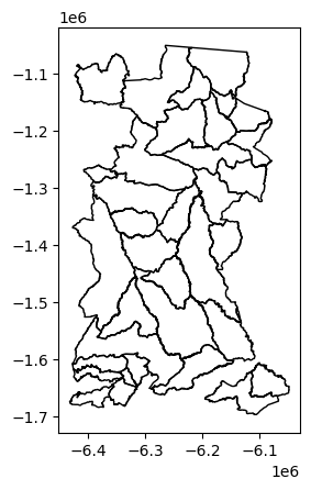
Before we do our zonal statistics, to make comparison fair we will consider only those municipalities whose boundaries are completely within the study area.
First, remove municipalities from the vector shapefile that are not completely within the study area.
Show code cell source
%matplotlib inline
pip_mask = munis.within(sa_gpd.loc[0, 'geometry']) #spatial query: select only munis within study area
sa_munis = munis[pip_mask==True] #remove non-selected munis
sa_munis.plot(facecolor='None') #check by plotting
<Axes: >
Next, create a raster from the new vector shapefile to mask cells from our land cover raster.
#collapse to list for rio.features.rasterize below
sa_munis_shapes = sa_munis[['geometry', 'CD_MUN']].values.tolist()
#get the spatial transform data needed for rio.features.rasterize below
lcxr_transform = lcxr['data'][0].rio.transform() #this only works if rioxarray has been loaded - why?
#create the mask raster (cells are CD_MUN for municipality polygons within study area, else -999)
sa_munis_r = rio.features.rasterize(sa_munis_shapes, fill=-999,
out_shape=lcxr['data'][0].shape,
transform=lcxr_transform)
#create xarray DataArray from the new raster
sa_munis_xr = xr.DataArray(data=sa_munis_r,
name='Municipality code',
dims=["y", "x"],
coords={'y':('y',lcxr.y.data),
'x':('x',lcxr.x.data)})
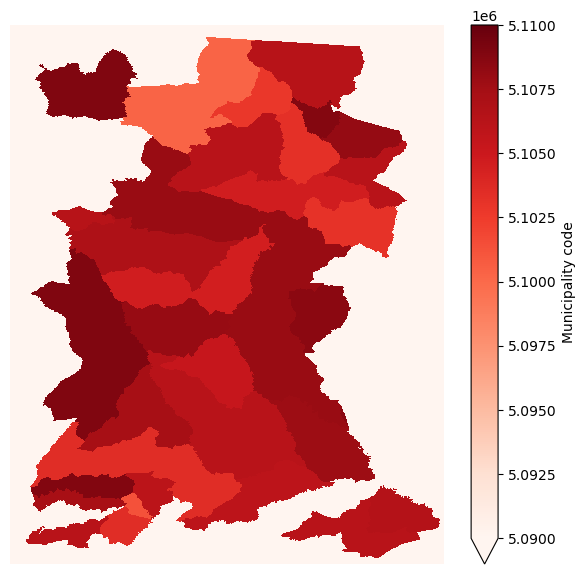
Let’s visualise the raster we’ve created from the vector shapefile of municipality boundaries.
Show code cell source
%matplotlib inline
fig,ax1=plt.subplots(figsize=(7,7))
sa_munis_xr.plot.imshow(
cmap='Reds',
vmin=5090000, vmax=5110000,
ax=ax1
)
plt.axis('off')
plt.show()
And finally, mask the existing land cover xarray DataSet with this new xarray DataArray.
#mask original land cover xarray with new xarray
lcxr_mask = lcxr.where(sa_munis_xr >0) #nodata was set to -999
Now let’s check the mask worked by plotting the new (masked) land cover data with the municipality polygons overlaid.
Show code cell source
%matplotlib inline
fig,ax1=plt.subplots(figsize=(8,8))
p = lcxr_mask['data'][0].plot(
cmap=lc_cmap,
vmin=vmin,
vmax=vmax,
ax=ax1
)
munis.plot(ax=ax1, facecolor='None', edgecolor='red', linewidth=1)
ax1.set_xlim(min(lcxr['data'][0].x), max(lcxr['data'][0].x))
ax1.set_ylim(min(lcxr['data'][0].y), max(lcxr['data'][0].y))
plt.show()
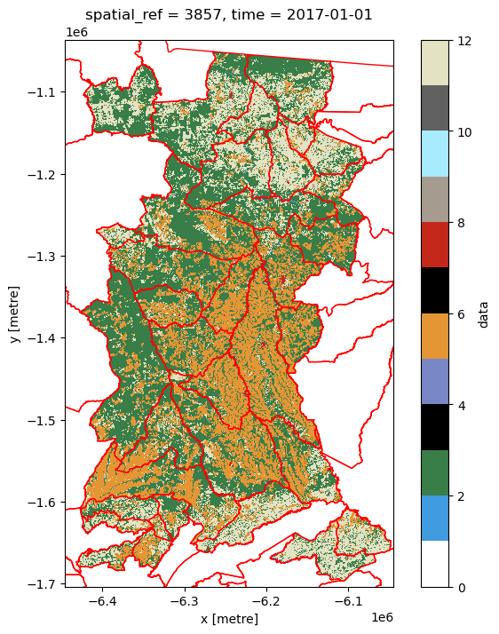
Note
From this plot you should be able to start thinking about the land cover composition of each municipality, and how they might differ. For example, which are the municipalities with relatively high (or low) crop cover compared to rangeland cover?
One last piece of data manipulation is needed as the zonal_stats function we will use from the rasterstats package expects a 2D array in a format that can be read by the rasterio package (e.g. a numpy array). Hence data are for a single year of our data set.
lcxr_transform = lcxr_mask['data'][0].rio.transform() #get the spatial transform info
lcxr_17 = np.array(lcxr_mask['data'][0].astype('int32')) #convert data for 2017 to numpy array
Zonal Stats#
Now we’re ready to actually calculate the statistics from the land cover raster by municipality shapefile polygon. When specifying that our input raster is categorical (as is the case for our land cover data), the zonal_stats function returns a list of dictionaries, one for each municipality polgyon. In turn, each dictionary provides cell counts (values) for each (land cover) class (keys).
#from rasterstats import zonal_stats
lcxr_17z = zonal_stats(sa_munis, lcxr_17,
affine=lcxr_transform,
categorical=True)
lcxr_17z
[{1: 467, 2: 55424, 4: 1, 5: 6225, 7: 296, 8: 79, 11: 40802},
{2: 1298, 5: 1340, 7: 71, 11: 2264},
{1: 390, 2: 9892, 5: 1536, 7: 49, 8: 54, 11: 16024},
{1: 76, 2: 28919, 5: 12480, 7: 79, 8: 90, 11: 3094},
{1: 262, 2: 10150, 4: 12, 5: 2246, 7: 118, 8: 32, 11: 23202},
{1: 4, 2: 3926, 5: 7005, 7: 28, 8: 3, 11: 4240},
{1: 15, 2: 33223, 4: 7, 5: 49192, 7: 188, 8: 63, 11: 15496},
{1: 34, 2: 14085, 4: 20, 5: 24556, 7: 39, 8: 284, 11: 972},
{1: 20, 2: 17018, 4: 5, 5: 13094, 7: 80, 8: 147, 11: 3680},
{1: 820, 2: 34203, 4: 79, 5: 6941, 7: 35, 8: 63, 11: 10356},
{1: 90, 2: 12272, 5: 28703, 7: 340, 8: 107, 11: 1758},
{1: 17, 2: 11858, 4: 21, 5: 5391, 7: 105, 8: 23, 11: 29141},
{1: 26, 2: 8113, 5: 3555, 7: 39, 8: 16, 11: 4179},
{1: 6, 2: 15114, 4: 2, 5: 4206, 7: 30, 8: 76, 11: 8255},
{1: 618, 2: 9902, 5: 1429, 7: 17, 11: 27368},
{1: 650, 2: 35901, 4: 16, 5: 5528, 7: 49, 8: 88, 11: 26713},
{1: 40, 2: 51898, 4: 16, 5: 50012, 7: 264, 8: 333, 11: 10289},
{1: 19, 2: 5981, 5: 2891, 7: 60, 11: 6914},
{1: 412, 2: 39336, 4: 126, 5: 4792, 7: 34, 8: 62, 11: 22007},
{1: 45, 2: 3675, 5: 847, 7: 18, 8: 3, 11: 6109},
{1: 6, 2: 5861, 5: 3779, 7: 29, 8: 24, 11: 19387},
{1: 133, 2: 49603, 4: 5, 5: 20542, 7: 49, 8: 423, 11: 9087},
{1: 1, 2: 3764, 4: 1, 5: 2178, 7: 15, 11: 7941},
{1: 16, 2: 27081, 4: 1, 5: 19384, 7: 88, 8: 98, 11: 6865},
{1: 32, 2: 24314, 5: 20581, 7: 22, 8: 59, 11: 11259},
{1: 280, 2: 19897, 4: 13, 5: 21250, 7: 812, 8: 286, 11: 3981},
{1: 356, 2: 32036, 4: 7, 5: 71821, 7: 455, 8: 263, 11: 4285},
{1: 35, 2: 58226, 4: 11, 5: 23880, 7: 76, 8: 244, 11: 15598},
{1: 42, 2: 25238, 5: 23900, 7: 123, 8: 269, 11: 3141},
{1: 8, 2: 8036, 4: 7, 5: 2251, 7: 45, 8: 32, 11: 17373},
{1: 21, 2: 15438, 5: 19175, 7: 68, 8: 205, 11: 951},
{1: 65, 2: 3043, 4: 61, 5: 1852, 7: 26, 8: 60, 11: 7849},
{1: 1, 2: 9736, 4: 3, 5: 3474, 7: 23, 8: 13, 11: 9437},
{1: 88, 2: 101187, 5: 23348, 7: 50, 8: 382, 11: 10755},
{1: 20, 2: 36506, 5: 673, 7: 40, 8: 4, 11: 22004}]
Tip
It’s easier to analyse this output if we store it as a Pandas DataFrame.
lcxr_17z_pd = pd.DataFrame(lcxr_17z) #convert list of dicts to DataFrame
lcxr_17z_pd.set_index(sa_munis['NM_MUN'],inplace=True) #use municipality name as index
lcxr_17z_pd.rename(columns=values_to_classes,inplace=True) #rename columns using dict created above
lcxr_17z_pd = lcxr_17z_pd.add_suffix('17') #remind ourselves these data are for a given year
lcxr_17z_pd.head()
| Water17 | Trees17 | Flooded vegetation17 | Crops17 | Built area17 | Bare ground17 | Rangeland17 | |
|---|---|---|---|---|---|---|---|
| NM_MUN | |||||||
| Alta Floresta | 467.0 | 55424 | 1.0 | 6225 | 296 | 79.0 | 40802 |
| Arenápolis | NaN | 1298 | NaN | 1340 | 71 | NaN | 2264 |
| Carlinda | 390.0 | 9892 | NaN | 1536 | 49 | 54.0 | 16024 |
| Cláudia | 76.0 | 28919 | NaN | 12480 | 79 | 90.0 | 3094 |
| Colíder | 262.0 | 10150 | 12.0 | 2246 | 118 | 32.0 | 23202 |
We could examine these total counts, but in many ways it is more useful to consider the proportion of a muncipality that is covered by each land cover.
lcxr_17z_pd['sum17']=lcxr_17z_pd.sum(axis=1) #add column for total cells in the muni
lcxr_17prop_pd = pd.DataFrame(index = lcxr_17z_pd.index) #create a new DataFrame to hold the proportions
#calculate proportion for each land cover
for column in lcxr_17z_pd.loc[:,'Water17':'Rangeland17']:
lcxr_17prop_pd['{}-prop'.format(column)] = lcxr_17z_pd[column] / lcxr_17z_pd['sum17']
lcxr_17prop_pd.head()
| Water17-prop | Trees17-prop | Flooded vegetation17-prop | Crops17-prop | Built area17-prop | Bare ground17-prop | Rangeland17-prop | |
|---|---|---|---|---|---|---|---|
| NM_MUN | |||||||
| Alta Floresta | 0.004521 | 0.536566 | 0.000010 | 0.060265 | 0.002866 | 0.000765 | 0.395008 |
| Arenápolis | NaN | 0.261009 | NaN | 0.269455 | 0.014277 | NaN | 0.455258 |
| Carlinda | 0.013956 | 0.353981 | NaN | 0.054965 | 0.001753 | 0.001932 | 0.573412 |
| Cláudia | 0.001699 | 0.646408 | NaN | 0.278957 | 0.001766 | 0.002012 | 0.069158 |
| Colíder | 0.007273 | 0.281772 | 0.000333 | 0.062351 | 0.003276 | 0.000888 | 0.644106 |
We could create a-spatial plots (e.g. bar plots) directly from this DataFrame. To create spatial plots (maps) we need to attach the spatial information for each municipality to create a GeoPandas GeoDataFrame:
lcxr_17prop_gpd = pd.merge(sa_munis, lcxr_17prop_pd, how='left', left_on = 'NM_MUN', right_index=True)
lcxr_17prop_gpd.head()
| CD_MUN | NM_MUN | SIGLA | AREA_KM2 | geometry | Water17-prop | Trees17-prop | Flooded vegetation17-prop | Crops17-prop | Built area17-prop | Bare ground17-prop | Rangeland17-prop | |
|---|---|---|---|---|---|---|---|---|---|---|---|---|
| 2 | 5100250 | Alta Floresta | MT | 8955.410 | POLYGON ((-6219130.124 -1056088.035, -6219229.... | 0.004521 | 0.536566 | 0.000010 | 0.060265 | 0.002866 | 0.000765 | 0.395008 |
| 12 | 5101308 | Arenápolis | MT | 417.337 | POLYGON ((-6330913.103 -1615920.187, -6330922.... | NaN | 0.261009 | NaN | 0.269455 | 0.014277 | NaN | 0.455258 |
| 26 | 5102793 | Carlinda | MT | 2421.788 | POLYGON ((-6212162.920 -1088961.922, -6211814.... | 0.013956 | 0.353981 | NaN | 0.054965 | 0.001753 | 0.001932 | 0.573412 |
| 29 | 5103056 | Cláudia | MT | 3843.561 | POLYGON ((-6153965.646 -1263744.447, -6153909.... | 0.001699 | 0.646408 | NaN | 0.278957 | 0.001766 | 0.002012 | 0.069158 |
| 31 | 5103205 | Colíder | MT | 3112.091 | POLYGON ((-6175226.198 -1146318.365, -6175285.... | 0.007273 | 0.281772 | 0.000333 | 0.062351 | 0.003276 | 0.000888 | 0.644106 |
And now we can do a static plot to visualise the proportion of two land covers across the municipalities.
Show code cell source
%matplotlib inline
cols = ['Crops17-prop','Rangeland17-prop'] #columns to plot
cbins = [0.15,0.3,0.45,0.6,0.75] #classification bins for plotting
fig, ax = plt.subplots(1, 2, figsize=(9, 30))
for ix, col in enumerate(cols):
lcxr_17prop_gpd.plot(
column=col, cmap='viridis',
scheme='UserDefined',
classification_kwds={'bins': cbins},
linewidth=0.,
legend=True, legend_kwds={"title":col,"loc": 5},
ax=ax[ix]
)
ax[ix].title.set_text(cols[ix])
ax[ix].set_xlim(-6450000,-5750000) #axis limits to fit legend
ax[ix].set_xlabel('x [metre]')
ax[ix].set_ylabel('y [metre]')
plt.show()
An interactive plot enables linked pan/zoom of the two variables (although without consistent classification of polygons).
Show code cell source
cols = ['Crops17-prop','Rangeland17-prop'] #columns to plot
#import hvplot.pandas # noqa
hv.extension('bokeh')
lcxr_17prop_interactive = lcxr_17prop_gpd.hvplot(
c=cols[0],geo=True, crs=lcxr_17prop_gpd.crs.to_epsg(),cmap='viridis', title=cols[0]) + lcxr_17prop_gpd.hvplot(
c=cols[1],geo=True, crs=lcxr_17prop_gpd.crs.to_epsg(),cmap='viridis', title=cols[1])
lcxr_17prop_interactive
Note
From these plots we should be able to see what we might have expected from the raster data: municipalities in the north and south of the study area are dominated by rangeland, while those in the centre are dominated more by cropland. We might then think about what social, economic, political or other characteristics of the municipalities have led to this situation.
To examine change through time, we need to calculate the zonal stats for a second year, then calculate proportional change between the two time points. First the zonal stats.
Show code cell source
lcxr_21 = np.array(lcxr_mask['data'][4].astype('int32')) #convert data for 2021 to numpy array
lcxr_21z = zonal_stats(sa_munis, lcxr_21,
affine=lcxr_transform,
categorical=True)
lcxr_21z_pd = pd.DataFrame(lcxr_21z) #convert list of dicts to DataFrame
lcxr_21z_pd.set_index(sa_munis['NM_MUN'],inplace=True) #use municipality name as index
lcxr_21z_pd.rename(columns=values_to_classes,inplace=True) #rename columns using dict created above
lcxr_21z_pd = lcxr_21z_pd.add_suffix('21') #remind ourselves these data are for a given year
lcxr_21z_pd['sum21']=lcxr_21z_pd.sum(axis=1) #add column for total cells in the muni
lcxr_21z_pd.head()
| Water21 | Trees21 | Flooded vegetation21 | Crops21 | Built area21 | Bare ground21 | Rangeland21 | sum21 | |
|---|---|---|---|---|---|---|---|---|
| NM_MUN | ||||||||
| Alta Floresta | 467 | 54865 | 1.0 | 9039 | 337 | 194.0 | 38391 | 103294.0 |
| Arenápolis | 2 | 1312 | NaN | 2032 | 76 | NaN | 1551 | 4973.0 |
| Carlinda | 390 | 9823 | NaN | 2617 | 49 | 80.0 | 14986 | 27945.0 |
| Cláudia | 607 | 26625 | 1.0 | 14700 | 65 | 76.0 | 2664 | 44738.0 |
| Colíder | 376 | 10263 | 3.0 | 4660 | 140 | 24.0 | 20556 | 36022.0 |
Now calculate the proportional change between the two years.
Show code cell source
lcxr_1721z_pd = pd.merge(lcxr_17z_pd, lcxr_21z_pd, how='left', left_index = True, right_index=True)
lcxr_1721prop_pd = pd.DataFrame(index = lcxr_1721z_pd.index) #create a new DataFrame to hold the proportions
lcpresent = ['Water','Trees','Flooded vegetation','Crops', 'Built area', 'Bare ground', 'Rangeland']
#calculate proportional change for each land cover
for column in lcpresent:
initial = lcxr_1721z_pd['{}17'.format(column)]
final = lcxr_1721z_pd['{}21'.format(column)]
lcxr_1721prop_pd['{}-propD'.format(column)] = (final - initial) / initial
lcxr_1721prop_pd.describe()
| Water-propD | Trees-propD | Flooded vegetation-propD | Crops-propD | Built area-propD | Bare ground-propD | Rangeland-propD | |
|---|---|---|---|---|---|---|---|
| count | 34.000000 | 35.000000 | 15.000000 | 35.000000 | 35.000000 | 31.000000 | 35.000000 |
| mean | 0.546392 | 0.013755 | 0.626822 | 0.414401 | 0.132359 | 0.264670 | -0.218614 |
| std | 1.542047 | 0.092306 | 1.125911 | 0.465972 | 0.112021 | 1.151980 | 0.124551 |
| min | -0.315789 | -0.133255 | -0.750000 | 0.001309 | -0.177215 | -0.666667 | -0.518625 |
| 25% | -0.035096 | -0.012748 | 0.000000 | 0.078856 | 0.074984 | -0.253253 | -0.319861 |
| 50% | 0.013201 | -0.006975 | 0.363636 | 0.231721 | 0.142857 | -0.120419 | -0.187844 |
| 75% | 0.266516 | 0.011556 | 1.104396 | 0.607837 | 0.202041 | 0.273100 | -0.125082 |
| max | 6.986842 | 0.430131 | 3.571429 | 2.257058 | 0.358974 | 5.500000 | -0.014088 |
From the summary statistics we can already begin to see differences in the trajectories of change. To map change spatially we finally merge with the spatial information.
lcxr_1721prop_gpd = pd.merge(sa_munis, lcxr_1721prop_pd, how='left', left_on = 'NM_MUN', right_index=True)
Given that proportional change can be positive or negative, we should use a diverging colour palette.
Show code cell source
%matplotlib inline
cols = ['Crops-propD','Rangeland-propD'] #columns to plot
cbins = [-2,-1.5,-1,-0.5, 0, 0.5,1,1.5,2,2.5] #classification bins for plotting
fig, ax = plt.subplots(1, 2, figsize=(9, 30))
for ix, col in enumerate(cols):
lcxr_1721prop_gpd.plot(
column=col, cmap='RdYlGn', #colour palette
scheme='UserDefined',
classification_kwds={'bins': cbins},
linewidth=0.,
legend=True, legend_kwds={"title":col,"loc": 5},
ax=ax[ix]
)
ax[ix].title.set_text(cols[ix])
ax[ix].set_xlim(-6450000,-5750000) #axis limits to fit legend
ax[ix].set_xlabel('x [metre]')
ax[ix].set_ylabel('y [metre]')
plt.show()
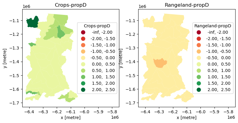
This allows us to see that all municipalities decreased their Rangeland cover and increased their Cropland cover between 2017 and 2021, and to locate municipalities with extremes of change (which we could then go and further investigate).
Summary#
This notebook introduce manipulation and exploratory analysis of classified land cover data. Specifically, it:
used
pystac-clientto access information from the Microsoft’s Planetary Computer API and used that withodc-stacto read land cover raster data from an online repository.used
matplotlibandholoviewsto visualise the spatio-temporal land cover data statically and interactively.used from
sklearnto create a matrix of pixel-by-pixel change and thenholoviewsto visualise that change using a Sankey diagram.used
rasterstatsto analyse zonal change with tabular data and visualisations.
Citing this Notebook#
Please see CITATION.cff for the full citation information. The citation file can be exported to APA or BibTex formats (learn more here).
Additional information#
Dataset: 10m Annual Land Use Land Cover (9-class) from Impact Observatory for 2017-2021.
License: The code in this notebook is licensed under the MIT License. The Environmental Data Science book is licensed under the Creative Commons by Attribution 4.0 license. See further details here.
Contact: If you have any suggestion or report an issue with this notebook, feel free to create an issue or send a direct message to environmental.ds.book@gmail.com.
Notebook repository version: v1.0.6
Last tested: 2024-03-11